
Regarding using photos for website design, you need to know a few technical requirements you need to know. Here are some key aspects and terms you would like to get familiar with to ensure there are no delays in launching your new website redesign:
Websites’ most common image formats are JPEG/JPG (Joint Photographic Experts Group) and PNG (Portable Network Graphics). JPEG is suitable for photographs and complex images, while PNG is often used for images with transparent backgrounds or graphics with sharp edges.
Advantages of PNG over JPEGS:
Optimize your images for web viewing by resizing them appropriately. Large image file sizes can slow down website loading times. The resolution for web images is typically 72 pixels per inch (PPI) or dots per inch (DPI).
Compressing images reduces file size without significantly sacrificing quality. This helps improve website performance. Online tools and software are available to compress images while maintaining an acceptable level of visual fidelity.
Consider the aspect ratio of your images to ensure they fit well within your website’s design. Maintaining consistency in image sizes and proportions throughout the site is essential for a cohesive look.
In website design, several aspect ratios are used for images, depending on the design layout and requirements. Here are some of the most common aspect ratios for website images:
16:9: This widescreen aspect ratio is commonly used for video content, hero banners, and featured images. It provides a broad and immersive visual experience.

4:3: This aspect ratio is often used for product images, galleries, or images that require a balanced composition. It provides a more squared or rectangular shape.
3:2: This aspect ratio is frequently used for photography and showcases images with a more traditional or standard rectangular shape. It offers a balanced composition and is often seen in portfolio websites or blogs.

1:1: This square aspect ratio is commonly used for profile pictures, thumbnails, or social media sharing. It offers a balanced, symmetrical composition and works well for small, square images.
9:16: This vertical aspect ratio is commonly used for mobile viewing or when images must be displayed in portrait orientation. It is suitable for mobile-friendly designs or social media stories.

3:1: This panoramic aspect ratio is used for wide images, such as landscape photography, scenic views, or banners that span the website’s width. It provides an overall visual effect.
It’s important to note that the specific aspect ratios used in website design can vary depending on the design trends, preferences, and the website’s particular goals and content. Designers often choose aspect ratios that best fit the website’s layout, visual hierarchy, and overall aesthetic.

Provide descriptive alt text for each image, which briefly describes the image’s content. Alt text is essential for accessibility and helps search engines understand the image’s context.
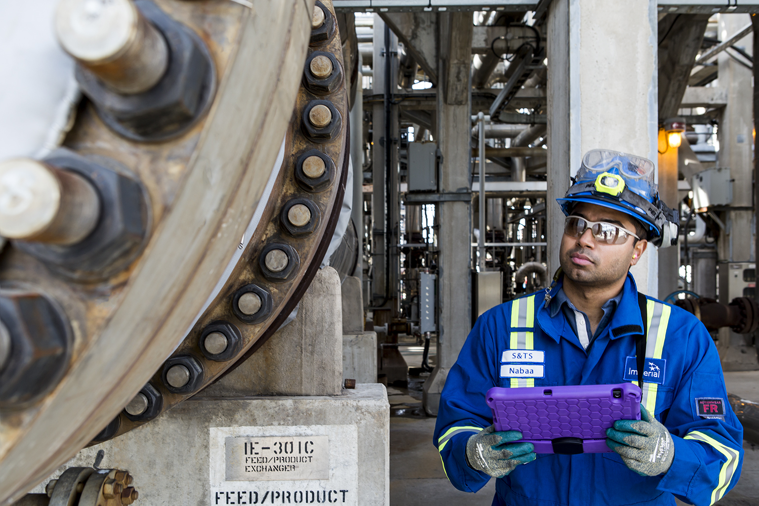
Alt Text: Male engineer inspecting heavy machinery in an oil and gas facility
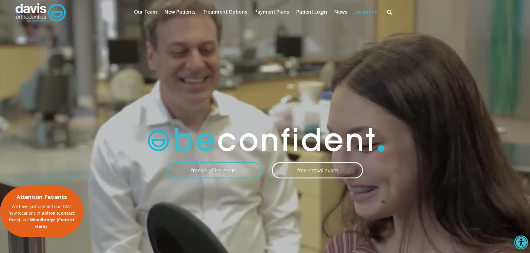
Opt for responsive images that adapt to different screen sizes and resolutions. This ensures your photos look good and load quickly on various devices, including desktops, laptops, tablets, and smartphones. Check out this website for Davis Orthodontics, where Donna Santos Studio teamed up with Duptronics in providing all photography assets (and videos to this website).
Ensure you have the appropriate rights and permissions to use the images on your website. It’s essential to respect copyright laws and correctly attribute pictures if required.
Consider your website’s overall visual style and branding when selecting and using images. Consistency in image style, colour palette, and tone can enhance the cohesiveness and professionalism of your website design.
Consider your website’s overall visual style and branding when selecting and using images. Consistency in image style, colour palette, and tone can enhance the cohesiveness and professionalism of your website design.
If you are in the process of rebranding and will soon need photography (or video) assets for your website, feel free to reach out to us for a consultation. Connect Today.


Posted By
Donna Santos
Categories
Corporate Media, Corporate Photography, Website Photography
Tags
branding, commercial photography, corporate photography, marketing, website photos