
Creating a guide to colour palette for photos, videos, and web design involves selecting colours that work harmoniously and align with the overall design goals and brand identity. For this blog’s case study, I contacted Michael Ball from Initiate Marketing and Andris Pone from Coin Branding to present one of our recent collaboration projects. We worked on branding, website design, and photo production for brianlaundry.ca.
1. Identify Brand Guidelines or Inspiration
Consider existing brand guidelines or style guides that dictate specific colours associated with your brand. If you still need to establish brand colours, look for sources of inspiration such as images, nature, art, or other websites that evoke the desired mood or aesthetic for your website.
2. Choose a Dominant Color for Web Design First
Select one or two primary colours that will be the foundation of your colour palette. These colours should reflect the brand personality, evoke the desired emotions, and align with the website theme. Consider the psychological effects of colours and the message you want to convey.
3. Explore Colour Harmony
Use colour theory and explore different colour harmonies to build your colour palette. Typical colour harmonies include complementary (opposite colours on the colour wheel), analogous (adjacent colours on the colour wheel), or triadic (three evenly spaced colours on the colour wheel). Online tools like Adobe Color or Coolors can assist in generating colour harmonies.
4. Consider Contrast and Accessibility, especially for photos
Ensure that the chosen colours have sufficient contrast to ensure readability and accessibility. High contrast between foreground and background colours is crucial for legibility, especially for text. Test colour combinations using contrast-checking tools like WebAIM’s Contrast Checker to ensure compliance with accessibility guidelines.
5. Select Supporting Colours
Choose a few additional colours to complement your dominant colours. These supporting colours can be used for accents, buttons, links, or other design elements. Consider using shades, tints, or variations of your dominant colours to maintain visual coherence.
6. Limit the Number of Colours
Keeping your colour palette limited to a few primary colours (around 3-5) is generally advisable to maintain consistency and prevent visual clutter. A defined colour palette makes creating a cohesive and visually appealing design more straightforward.
7. Test and Refine the Guide to Colour Palette for Photos, Videos and Web Design
Implement the colours into your website design and evaluate their visual impact. Make adjustments if needed to ensure the colours work well together and achieve the desired effect. Get feedback from colleagues or stakeholders to gather different perspectives.
8. Document Your Colour Palette
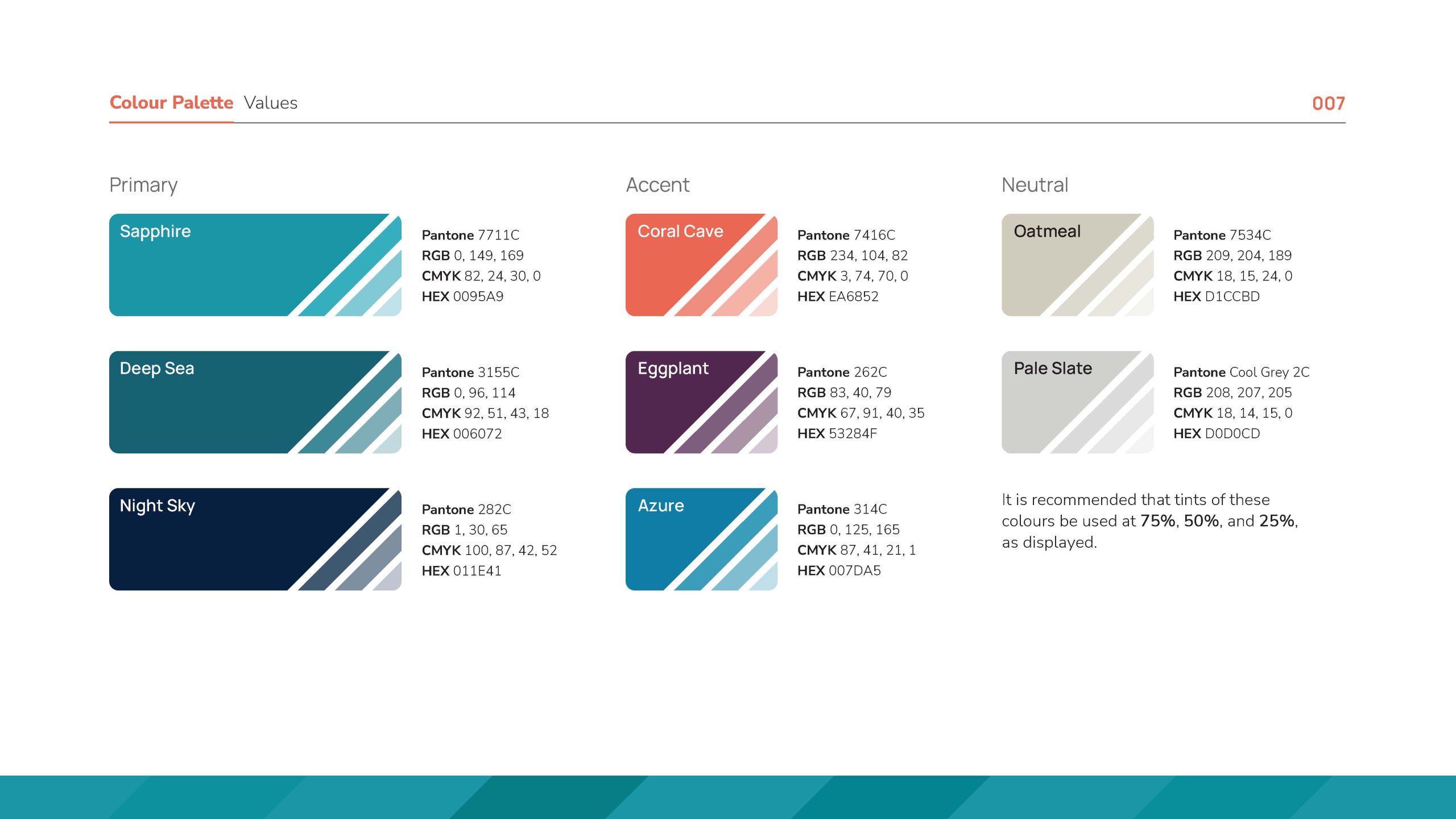
Create a style guide or document that outlines your chosen colours, including their hexadecimal (hex) or RGB values. This reference will help maintain consistency across design elements and ensure future design consistency. Remember, the colour palette should align with your brand identity, evoke the desired emotions, and support the overall user experience of your website. Review and refine your colour palette as your design evolves or if it no longer meets your goals.
Colour Palette for Photos and Videos
Don’t forget to share with your photographer and videographer
 When using a web colour palette in photos and videos, the goal is to ensure visual consistency and alignment with your overall brand or design concept. Here are some tips on how to incorporate a web colour palette into your photography and video work:
- Understand the Colour Palette for Photos
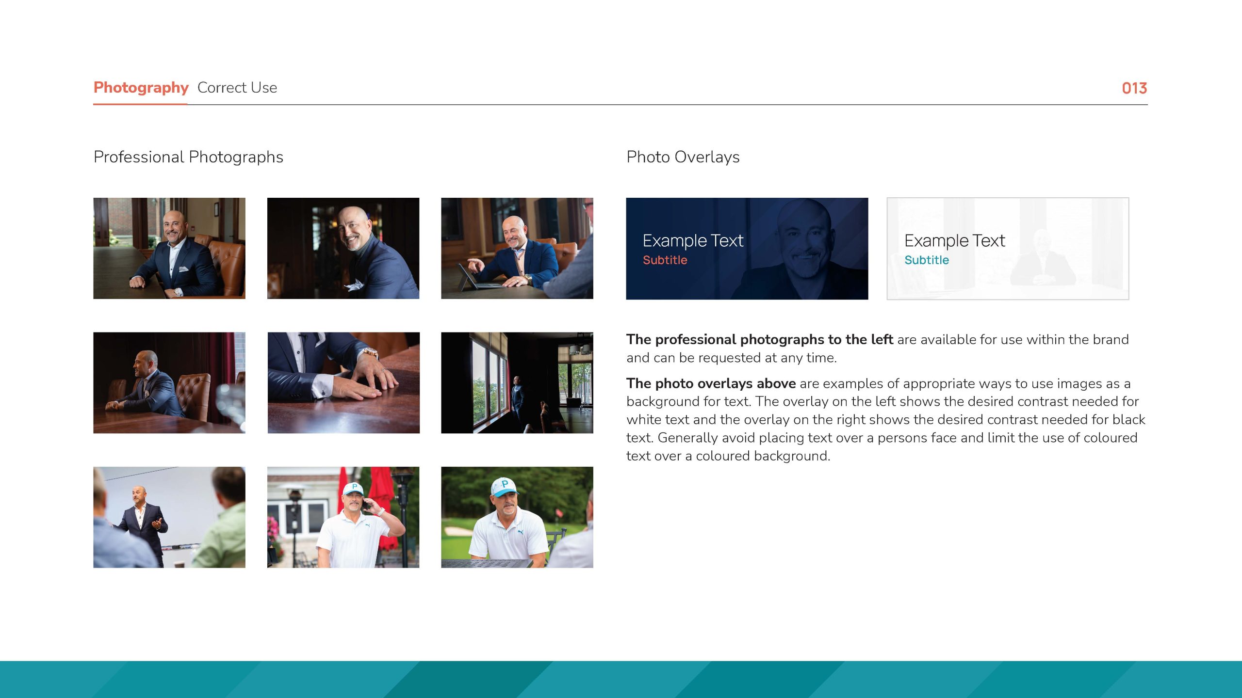
Familiarize yourself with the colours in your web colour palette, including their specific hex or RGB values. This knowledge will help you accurately identify and replicate those colours in your visual content. - Lighting and Environment Photos and Videos
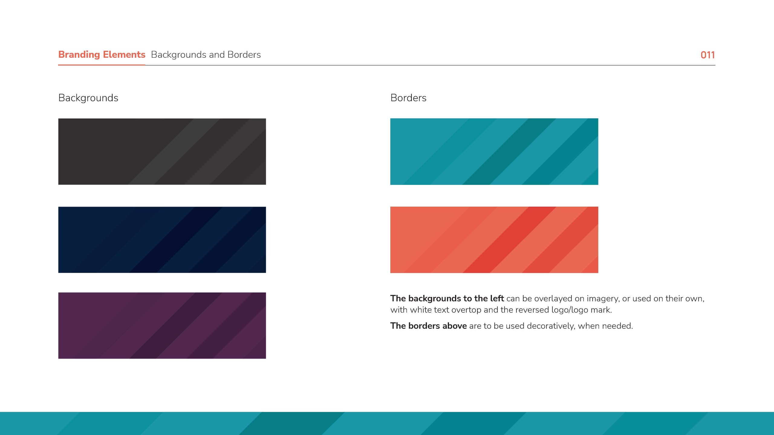
Consider the lighting conditions and environment where you shoot your photography or capture video footage. Ensure that the lighting doesn’t significantly alter the colours and that the surroundings complement or don’t clash with your chosen colour palette. - Props, Backgrounds, and Sets
Incorporate props, backgrounds, or set designs that feature the colours from your web colour palette. This can be achieved by choosing objects, backdrops, fabrics, or painted surfaces that align with your desired colour scheme. - Wardrobe and Styling
If your photography or video involves people or models, coordinate their wardrobe and styling to include colours from your web colour palette. This can be achieved through clothing choices, accessories, or makeup that reflect the chosen colours. - Colour Grading and Editing for Photos
During post-production, colour grading and editing, enhance or adjust the colours to match your web colour palette. Tools like Adobe Lightroom, Photoshop, or video editing software provide colour correction and grading capabilities that can help achieve the desired look. - Consistency and Balance
Maintain consistency in your visual content by ensuring that the colours from your web colour palette are well-balanced and appropriately distributed throughout the composition. Avoid overwhelming or disproportionate use of certain colours, as it may detract from the overall visual harmony. - Test and Adjust
Review your photography or video content against your web colour palette to assess how well the colours align. Adjust the colour balance, saturation, or hues during editing to achieve the desired visual consistency. - Consider Branding and Context
Remember the context in which your photography or video will be used, whether on your website, social media, or other marketing materials. Ensure that the colours in your visuals align with your overall branding and the intended message or mood you want to convey.
By incorporating the guide to the colour palette for photos, videos and web design, you can create a cohesive visual experience that strengthens your brand identity and maintains consistency across various mediums, especially in web design.


If you are currently rebranding and will soon require photography (or video) assets for your website, do not hesitate to contact us for a consultation. Connect Today.
Photos by: Donna Santos Studio
Logo, brand guidelines and web: Initiate Marketing
Branding: Coin Branding


Posted By
Donna Santos
Categories
Corporate Media, Corporate Photography, Website Photography
Tags
branding, commercial photography, corporate photography, video, website photos